For Quanta, partnership meant the difference between making a great ODM product and building a competitive brand.
THE LANGUAGE OF BRAND
Quanta is an established manufacturer of ODM servers and other components with an impressive list of industry-leading customers. In 2012, they decided to take their knowledge and expertise to market with a hardware line of their own under the name QCT.
While the company has earned a reputation for building exceptional products, the leadership team turned to Cobalt + Indigo to help build a brand worthy of its share of a competitive marketplace.
FOR YEARS, QUANTA BUILT HARDWARE FOR ESTABLISHED BRANDS. WHEN THE TIME CAME TO TAKE THEIR PRODUCTS TO MARKET UNDER THEIR OWN NAME, THEY KNEW THEY NEEDED TO SHOW UP WITH SOMETHING DIFFERENT.
Our approach to branding works from the inside out—with the understanding that the product is a vehicle for a brand’s promise. Each practical and aesthetic decision combines to create a user experience that communicates, informs, and engages.
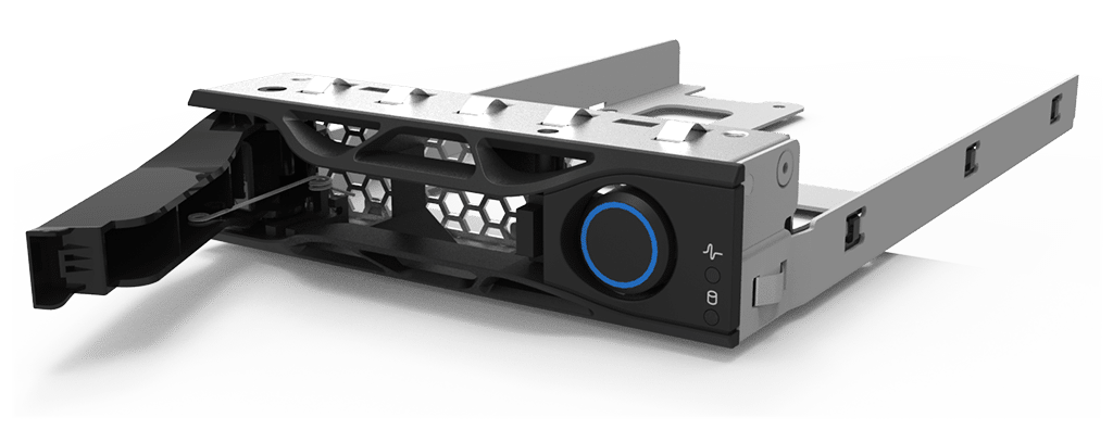
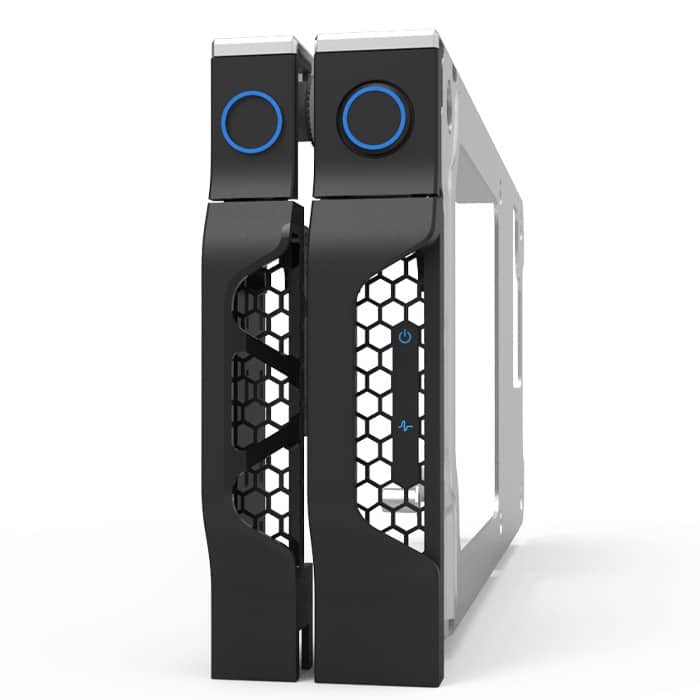
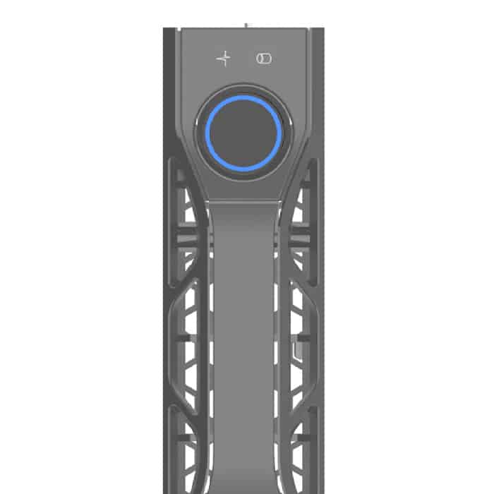
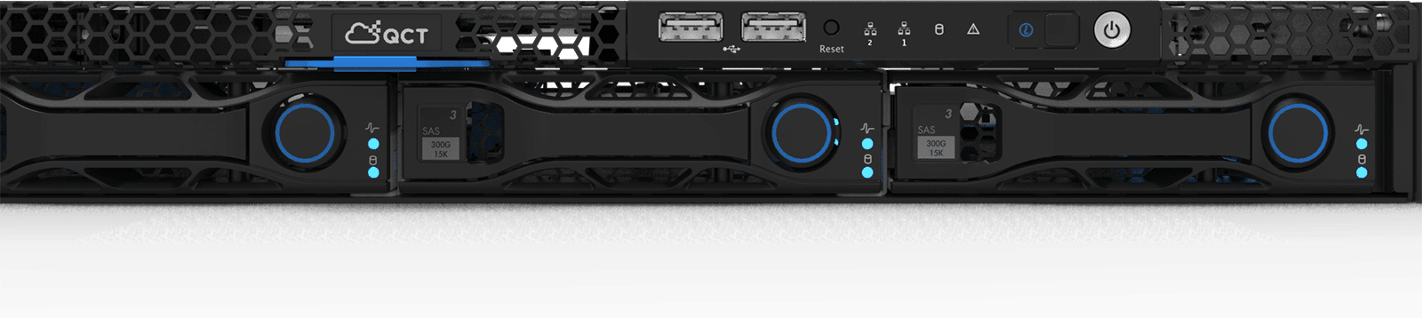
As the design and engineering processes evolved, two important themes emerged: a repeated hexagonal motif, and the color blue. The hexagonal theme serves practical and aesthetic considerations—expanding surface areas for better cooling and conveying precision and stability. Highlighting buttons, clips, and other elements in blue gives users precise information about where and how to power up, remove, open, and maintain the unit.
WHETHER THE MESSAGE IS UTILITY, QUALITY, CONVENIENCE, OR ALL OF THE ABOVE, EVERY ASPECT OF A PRODUCT’S DESIGN TELLS A STORY AND COMMUNICATES VALUE.
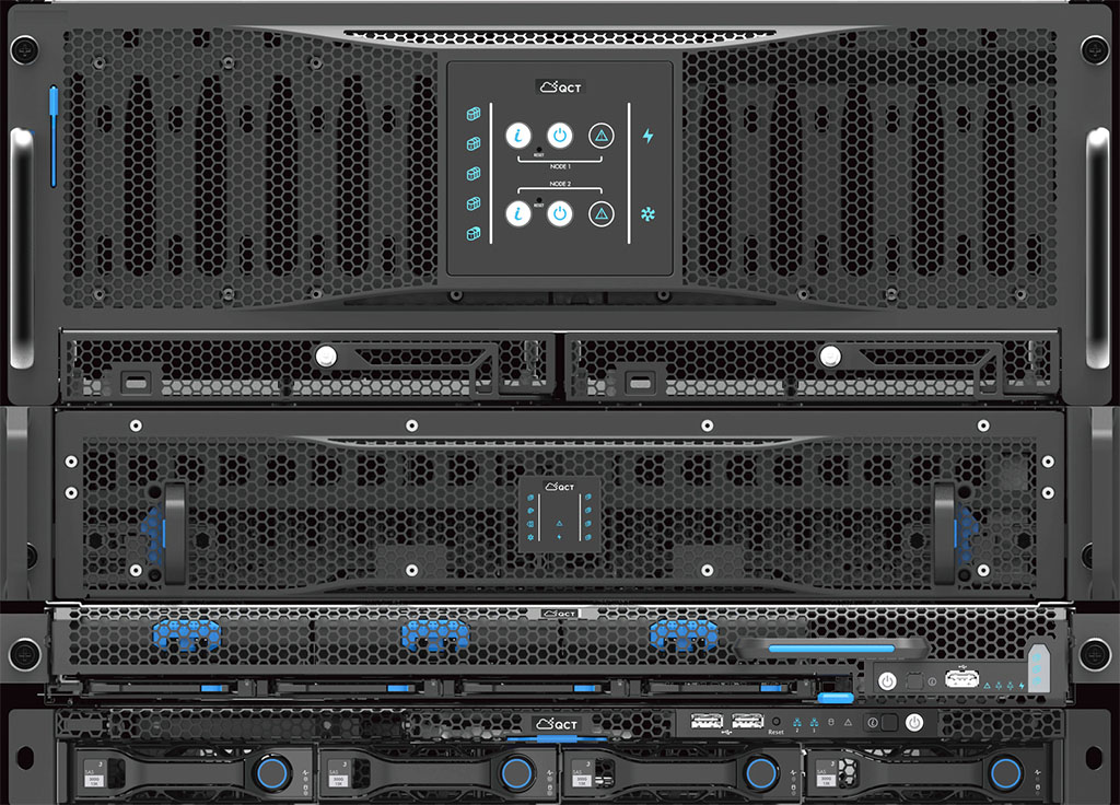
Although we were initially engaged to design one component, we anticipated and developed a visual system that would translate across a range of products of varying functions and configurations. To date, Cobalt + Indigo has designed 25 units for Quanta—each with its own characteristics, but all united by a strong brand identity.
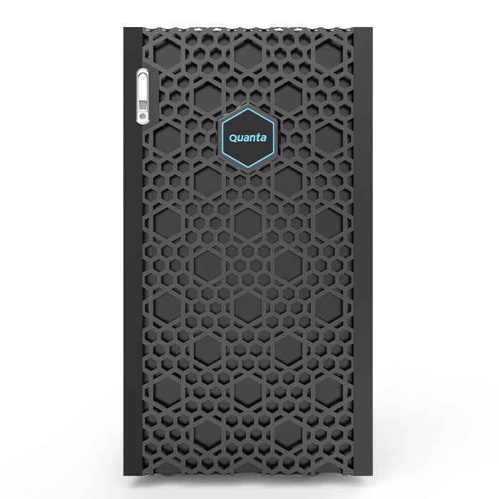
To maximize cooling, we developed a unique hexagonal “mesh” pattern. The hexagonal openings provide more structural integrity than squares and more ventilation area than circular openings.
The hexagonal motif extends beyond the vents to the hot-swap handle, the bezel, and other elements—increasing surface area for cooling and creating a distinctive visual theme.
Every functional element—from the power button to the cable management system—is rendered in blue. This gives users clear and highly intuitive visual cues about how to interact with the device.
SIMPLE, YET PURPOSEFUL DECISIONS ABOUT FORM, COLOR, MATERIALS, TEXTURES, AND FINISHES COMBINE TO CREATE A DISTINCTIVE VISUAL LANGUAGE FOR A PRODUCT AND A BRAND. THESE SUBTLE CUES SET EXPECTATIONS AND HELP DEFINE THE USER EXPERIENCE.
QUANTA
For Quanta, partnership meant the difference between making a great ODM product and building a competitive brand.
THE LANGUAGE OF BRAND
Quanta is an established manufacturer of ODM servers and other components with an impressive list of industry-leading customers. In 2012, they decided to take their knowledge and expertise to market with a hardware line of their own under the name QCT.
While the company has earned a reputation for building exceptional products, the leadership team turned to Cobalt + Indigo to help build a brand worthy of its share of a competitive marketplace.
FOR YEARS, QUANTA BUILT HARDWARE FOR ESTABLISHED BRANDS. WHEN THE TIME CAME TO TAKE THEIR PRODUCTS TO MARKET UNDER THEIR OWN NAME, THEY KNEW THEY NEEDED TO SHOW UP WITH SOMETHING DIFFERENT.
Our approach to branding works from the inside out—with the understanding that the product is a vehicle for a brand’s promise. Each practical and aesthetic decision combines to create a user experience that communicates, informs, and engages.
As the design and engineering processes evolved, two important themes emerged: a repeated hexagonal motif, and the color blue. The hexagonal theme serves practical and aesthetic considerations—expanding surface areas for better cooling and conveying precision and stability. Highlighting buttons, clips, and other elements in blue gives users precise information about where and how to power up, remove, open, and maintain the unit.
WHETHER THE MESSAGE IS UTILITY, QUALITY, CONVENIENCE, OR ALL OF THE ABOVE, EVERY ASPECT OF A PRODUCT’S DESIGN TELLS A STORY AND COMMUNICATES VALUE.
Although we were initially engaged to design one component, we anticipated and developed a visual system that would translate across a range of products of varying functions and configurations. To date, Cobalt + Indigo has designed 25 units for Quanta—each with its own characteristics, but all united by a strong brand identity.
To maximize cooling, we developed a unique hexagonal “mesh” pattern. The hexagonal openings provide more structural integrity than squares and more ventilation area than circular openings.
The hexagonal motif extends beyond the vents to the hot-swap handle, the bezel, and other elements—increasing surface area for cooling and creating a distinctive visual theme.
Every functional element—from the power button to the cable management system—is rendered in blue. This gives users clear and highly intuitive visual cues about how to interact with the device.
SIMPLE, YET PURPOSEFUL DECISIONS ABOUT FORM, COLOR, MATERIALS, TEXTURES, AND FINISHES COMBINE TO CREATE A DISTINCTIVE VISUAL LANGUAGE FOR A PRODUCT AND A BRAND. THESE SUBTLE CUES SET EXPECTATIONS AND HELP DEFINE THE USER EXPERIENCE.